

KPCC is a trusted, member-supported public radio station that operates across southern California. They’re known for popular radio programs such as Airtalk, Take Two, and The Frame, and for popular podcasts such as The Big One, Tell Them I Am, and Repeat.
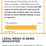
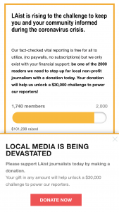
KPCC needed a way to reduce friction when donating online. To help, we strategically placed a donation widget at the top of their homepage that would give visitors an easy way to start the donation process. This resulted in a tremendous increase in donations over previous campaigns.
“The experiment succeeded with a whopping $100,300 in additional donations on its first try.”

They recently wrote an article that detailed the hurdles that users had to overcome in order to donate:
Our call-to-action on air is “Go to KPCC.org to donate,” because it’s easier to say and to remember than the homepage URL plus “slash donate or join.” KPCC.org is also where most of our web visitors land to listen live.
But once you get to KPCC.org, there are still more steps a donor has to take before they can make their donation. They have to find specific calls to action on the homepage — either by clicking on a banner or the small and often hard-to-find “donate” button at the top of the page — which will bring them to the donation form.
Deanna Archetto, KPCC’s on-air membership manager and Danny Sway, KPCC’s digital membership manager, February 2020
This pain point sparked an idea to place the donation form directly onto the homepage. Potentially, there would be much less cognitive load when searching for the donation form, and users would more likely finish the donation form if they started sooner.
From a user experience standpoint, KPCC’s homepage was optimized for displaying stories and wasn’t originally intended to feature any embedded content.
While we could have implemented the form as an embedded iframe of KPCC’s official form, there were too many required fields in the official form, and it wouldn’t be properly optimized for the homepage’s layout.
It was also important that the donation form loaded quickly on the page, matched the styles of the site, and could be easily edited by KPCC’s membership team.
We collaborated with KPCC’s membership team to narrow down the important fields to expose on the homepage widget. We then worked with developers from Springboard by Jackson River, KPCC’s new donation portal, to create a tool that automatically preselects fields by query parameters.
With that, we were able to create a flexible, dynamic donation form widget that allowed users to easily select a donation amount. They could also select whether they wanted to make a monthly or one time donation. Their choices would be carried over to the official form.
On the admin side, we created a tool that enabled KPCC’s membership team to easily change the copy of the widget. This allows them to experiment and iterate on their messaging.
The experiment succeeded with a whopping $100,300 in additional donations on its first try. The next iteration brought forth $98,000, which is “an 18% increase over the same fundraiser in 2018.”
This proves that if you can save your users even a bit of time, it’ll lead to better conversion rates and more opportunities. The donation form widget has been so useful that it continues to be a staple of KPCC’s homepage to this day.